These guidelines and tips will help you have a home that feels well put together and beautiful…your next level home!
Let’s start with the basic design principles you should pay close attention to.
1. HARMONY
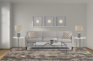
Harmony is the foundation of your design. It is created when all pieces of furniture and decor feel like they belong together in the space. It doesn’t mean you have to be matchy matchy, it means there should be cohesiveness based on either theme, style, aesthetic, or mood.
Tip: create harmony by sticking to one theme, like farmhouse or modern, by using the same accent colors throughout the room, or patterns that work well together.
In the living room below, color and furniture styles creates harmony.
2. EMPHASIS
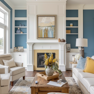
A focal point is usually the main emphasis in the room. Depending on the room, it may be a fireplace, an accent wall, a large piece of furniture, etc. The fireplace and built-ins, accentuated even more with wall color, are the focal point in this living room.
In a bedroom, usually the bed wall is the focal point.
Tip: Determine the focal point in the room and decorate it so it stands out.
2. SCALE and PROPORTION
Scale refers to how the items relate to the size of the room. For example, in a small room you would use furniture that is small scale, where in a large room with high ceilings you can use taller and bigger furniture. The sofa below is obviously too large for the space.
Proportion is how an item relates to other things in the room. Are the lamps in proportion to the sofa? Are the chairs the right size next to the sofa? ..and so on. In the room above, if the spoon was large enough for the sofa, the lamps and items on the table behind it would be too small in proportion to the sofa. However, they are the right scale in relation to the size of the wall and the room.
Below you can easily see the difference between good scale and proportion. On the left, the art is too small, and the lamps and end tables are too big. On the right it’s just the right size or proportion as related to each other.
Below are two moodboards using the same furnishings, the first one with the wrong scale and proportion, the second one with the right one. Huge difference …and that’s only one wall!
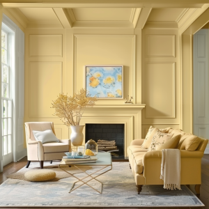
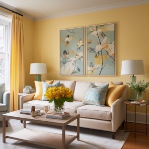
In this pretty yellow room below, everything is in proportion to each other – the pillows, tables, lamps, and artwork are all the right size for the sofa.
Tip: start with the large pieces of furniture first and make sure they are the right scale for the space and the right proportion when compared to each other. Then add smaller pieces of furniture and accessories.
3. RHYTHM AND CONTRAST
Is about creating patterns of repetition and contrast. Repeating color, pattern, texture and shapes throughout a space to create movement and flow throughout the space. It keeps the eye moving around the room so it doesn’t feel flat and makes it interesting. Our brain finds it organized and pleasing. However our brains also like to see a little contrast! (a little and not a ton to keep it pleasing)
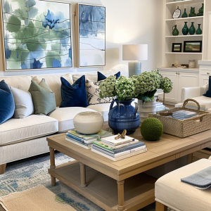
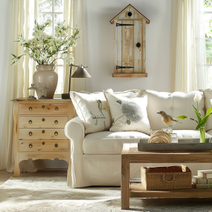
In this living room, your eye moves from the blues and greens in the artwork to the blues and greens on the sofa, coffee table, and built-ins. Same with the neutrals, they are repeated around the room. The colors provide the contrast as well as the different textures in fabrics, wood, ceramic, wicker basket, florals…
Tip: you may repeat color (pillows, vase, art), a pair of chairs that are the same, same end tables…then add a little contrast such as a square box on a round table with round lamps, or a third chair that is different from the pair.
4. BALANCE
Balance is about equilibrium. It’s the distribution of visual weight around the room to make it feel stable and relaxed. Imagine the furniture being on a scale, you want both sides of the room to have similar “weights” in order to feel balanced. This also applies to accessories. We don’t want all the heavy tall accessories on one side of a built-in or console and small ones on the other.
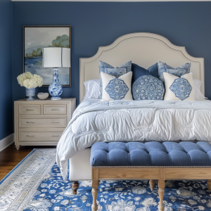
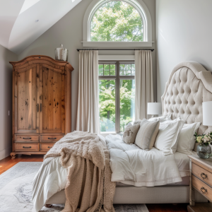
In this bedroom, the large armoire is balanced by a tall and heavy headboard.
Tip: visual weight is as important as actual weight. A dark textured vase will have more visual weight than a clear glass vase of the same size.
The living room below has well balanced architecture with built-ins on both sides of the windows. The design has also been balanced with the accessories. The sofa’s visual weight is balanced by chairs in the opposite side and the darker wood tables. The rug and dark ottoman anchors the room.
In the living room below, balance has been created by positioning the chairs on each side of the sofa, and the sofa is balanced with the media cabinet and tv across from it. The blue accent color is balanced between the chairs, the sofa pillows, and the rug.
5. DETAILS
Details are a must and they add your personality into your home! Maybe you have items you have collected from travels, maybe you love birds…you can incorporate things you love into your decor and give your home a look that is just yours!
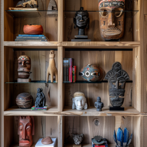
Tip: Add family pictures, items from travels or favorite hobbies, cultural items, unique wall details…make it yours!
HELPFUL MEASUREMENTS AND GUIDELINES
Not everything in design is an absolute, but these are good guidelines to follow!
LIVING ROOMS
- Create conversation areas where furniture is no more no more than 8-10’ apart. It’s ok for furniture to be away from wall.
- When pairing a sofa and accent chairs choose similar seat heights, no more than 4″ of each other.
- Table or Cabinet behind sofa – Same height or a few inches shorter than the back of your sofa, but not higher. Not as wide as sofa, about 6″ of space on either end.
- Mix leg styles on furniture…low leg sofa with high leg chairs
Coffee Table
- Close to 2/3 of the length of your sofa
- No more than 3” lower or higher than sofa
- Allow approximately 18” between sofa and coffee table
Rug
- At least front legs of furniture must sit on rug to anchor it
- Ideally allow about 24″ between the wall and the rug in a large living room, and between 10″ to 18″ in a smaller one.
TV Height
- center of the screen 30“ above the lowest seat height in the room.
- distance between Tv and sofa or chair: 1.5 times the diagonal measurement of the TV or about 7′.
*Height rules seem to be changing since we are now installing TVs higher, above fireplace mantles. Just make sure it’s comfortable on your neck.
Art
- Art height should be eye level, with center about 60-64” inches above floor
- When placing above sofa or console, 6-10” It should feel connected to the piece of furniture below it, not floating way up by itself.
- Art width about 2/3 of the width of the furniture below it.
DINING ROOM
Here is a seat guideline for rectangle tables depending on size:
• 48″long table: seats 4
• 60″-72″ table: seats 6
• 80″-87″ table: seats 8
• 92″-108″ table: seats 10
• 120″ table: seats 12
Round tables
• 42″-48″ diameter table seats 4
• 60″ diameter table seats 6-8
If using a rug in the dining room
- Ideally allow at least 24-30″ from the edge of your table to the edge of the rug so chairs can be pulled out on the rug
- ideally allow 12” between edge of rug and wall
Lighting
- chandelier to be about half the width of your dining table, or add the room’s feet for length and width. That number in inches suggests an approx. size for the diameter of your chandelier. If you have a 10′ x 12′ room you chandelier should be 10+12= 22″ in diameter.
- A rectangular chandelier should be 6” shorter than the table on each side.
- Hang your light fixture so the bottom is 30″-36″ above the table
BEDROOM
- Space permitting, you ideally want about 36″ around your bed and all walkways to comfortably get around your space.
- Rug – extend at least as wide as the nightstands and about 36” on each side of the bed. Typically 8×10 for queen bed, 9×12 for king
- Bench at Foot of the Bed-about 3/4 the width of the bed and slightly lower than bed
- Nightstand Height – Close to mattress height or up to 5” higher
GENERAL LIGHTING GUIDELINES
Calculating lighting width
A) Multiply your ceiling height by 2.5 – 3 So if you have a 10 ft ceiling you would multiply it by 2.5 giving you 25″. That should be your approximate hanging ceiling light width.
B) Measure the length and width of the room. The sum equals the number of inches for the width of your light fixture. For example, if your room is 12 feet by 16 feet, 12+16=28 so your ceiling light should roughly be 28” wide.
Wall sconces
- 5′ to 6′ up from the floor. There should be 3 – 6″ between a wall sconce and the edge of a mirror or piece of art it’s next to.
Can Lights
- A general rule for placement is to divide the height of the ceiling by two. The result is the amount of space to leave between each light. For example, recessed lighting spacing for an 8-foot-high ceiling would be 4 feet between each light.
- Leaving about 14 to 18 inches of space between the light cannisters and cabinets will also help avoid lost light.
In an open space where people are walking
- 7 feet is the minimum distance the bottom of a hanging light fixture should be from the floor. But for ceilings over 8 feet just add 3 inches of hanging height per foot. So if your ceilings are 10 feet tall, the light fixture should be about 8.5 feet from the floor.
Pendants above island
- 30” to 36” above. Should be high enough that it does not obstruct the view of the tallest person living in the home to use the island.
Want more direction putting a plan together or getting a design done for you?
Contact me to schedule an in-person, phone or virtual consultation.
e@nextlevelinteriors.com 678-935-(NEXT) 6398