Next Level Interiors.com

Favorite Colors, Color Palettes & Best Tips

Did you know that color is the first thing everyone notices when they walk in a room?

Color also sets the mood for the space, from calm to bold and energetic.  It makes sense then that every design plan should have a color plan, whether it is monochromatic neutrals, color used a s an accent, or lots of colors. 

Let’s start with a few tips that will help you when selecting and using Color:

1. Choose your wall color after you have selected furniture, fabrics, artwork, and rugs. There are more choices for paint (including neutrals) so it is easier to choose a paint color that goes with textiles than the other way around. 

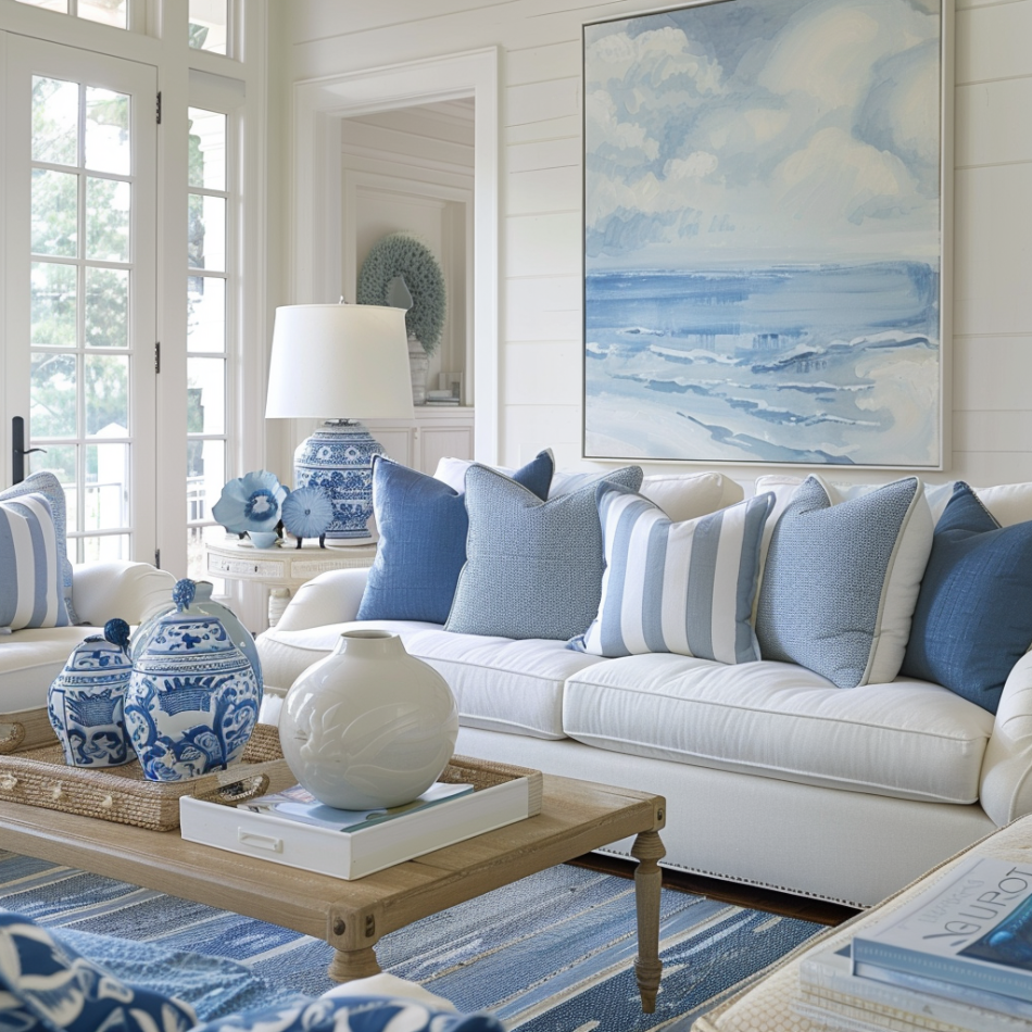
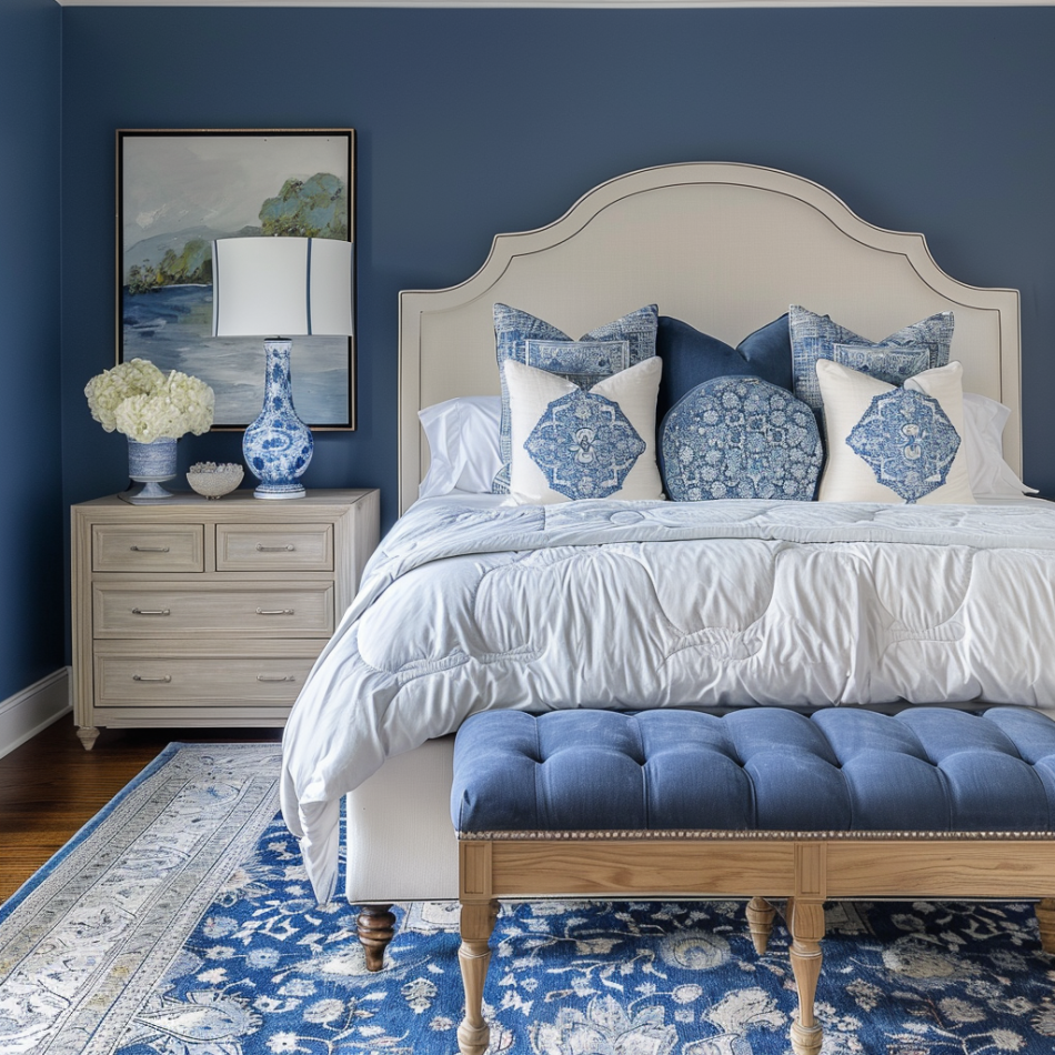
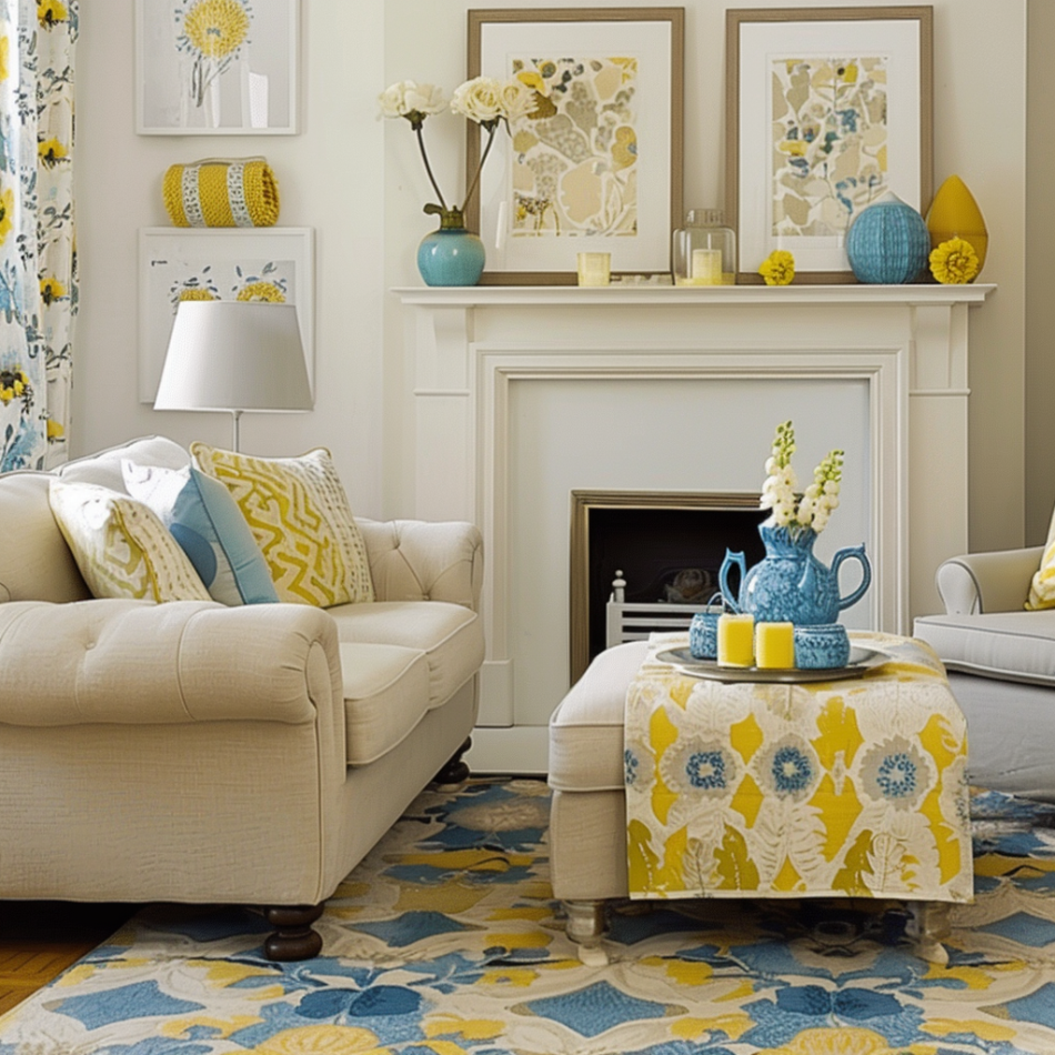
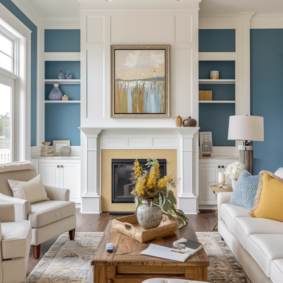
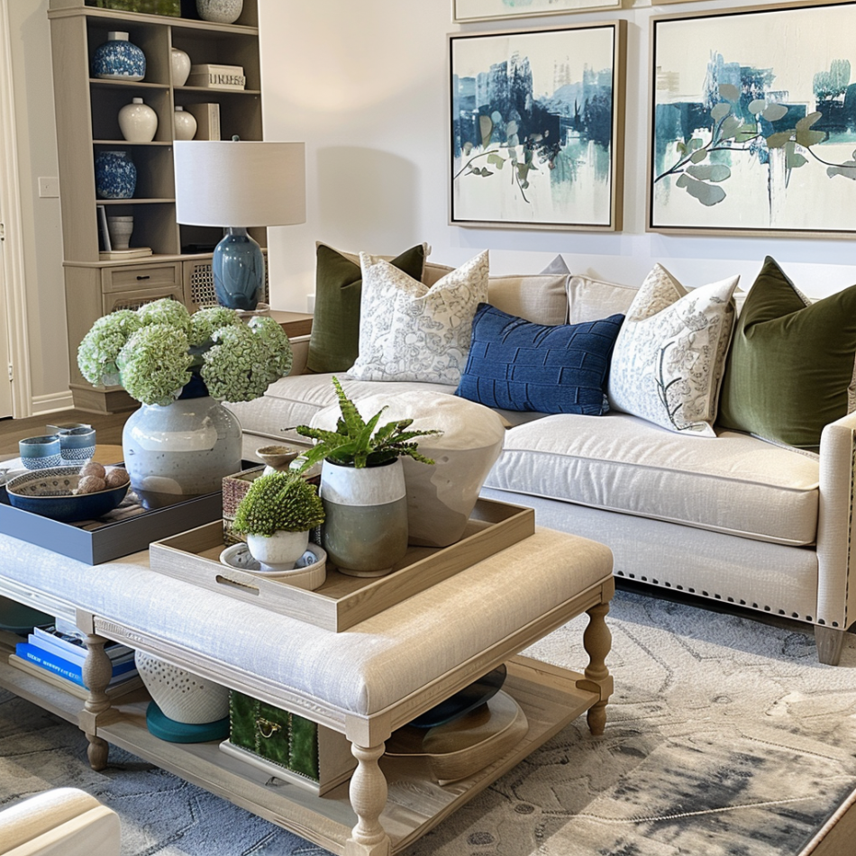
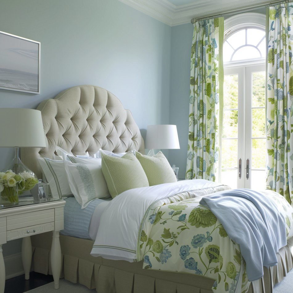
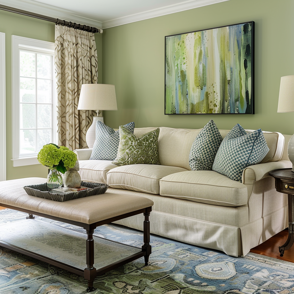
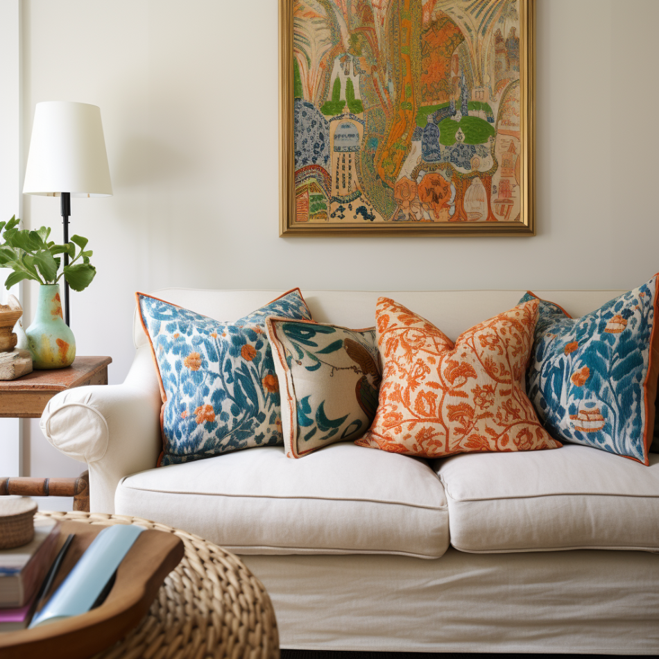
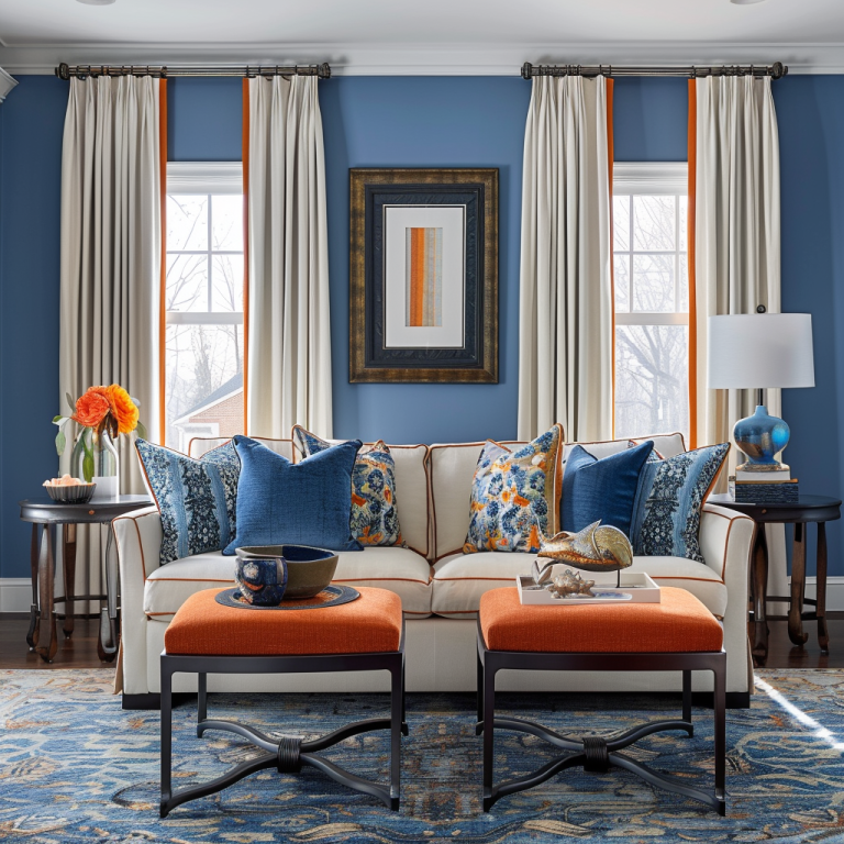
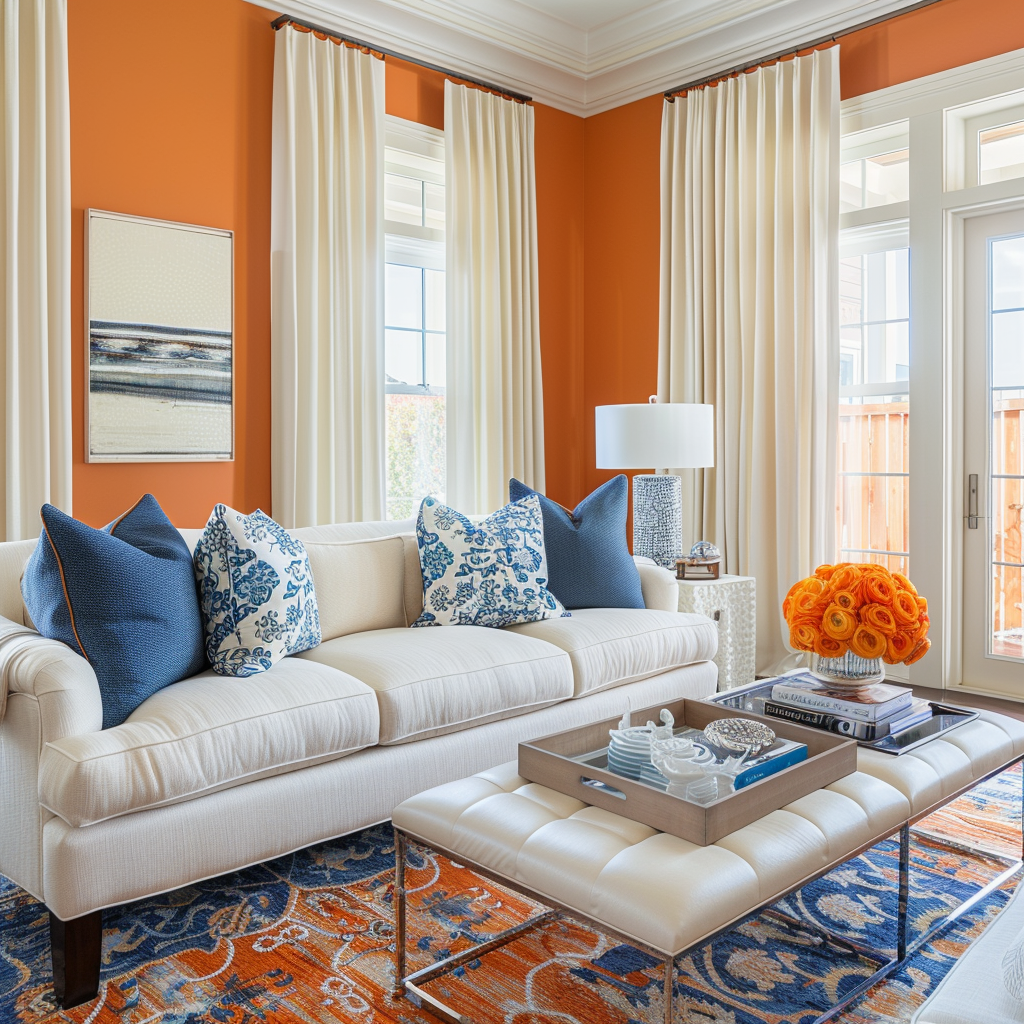
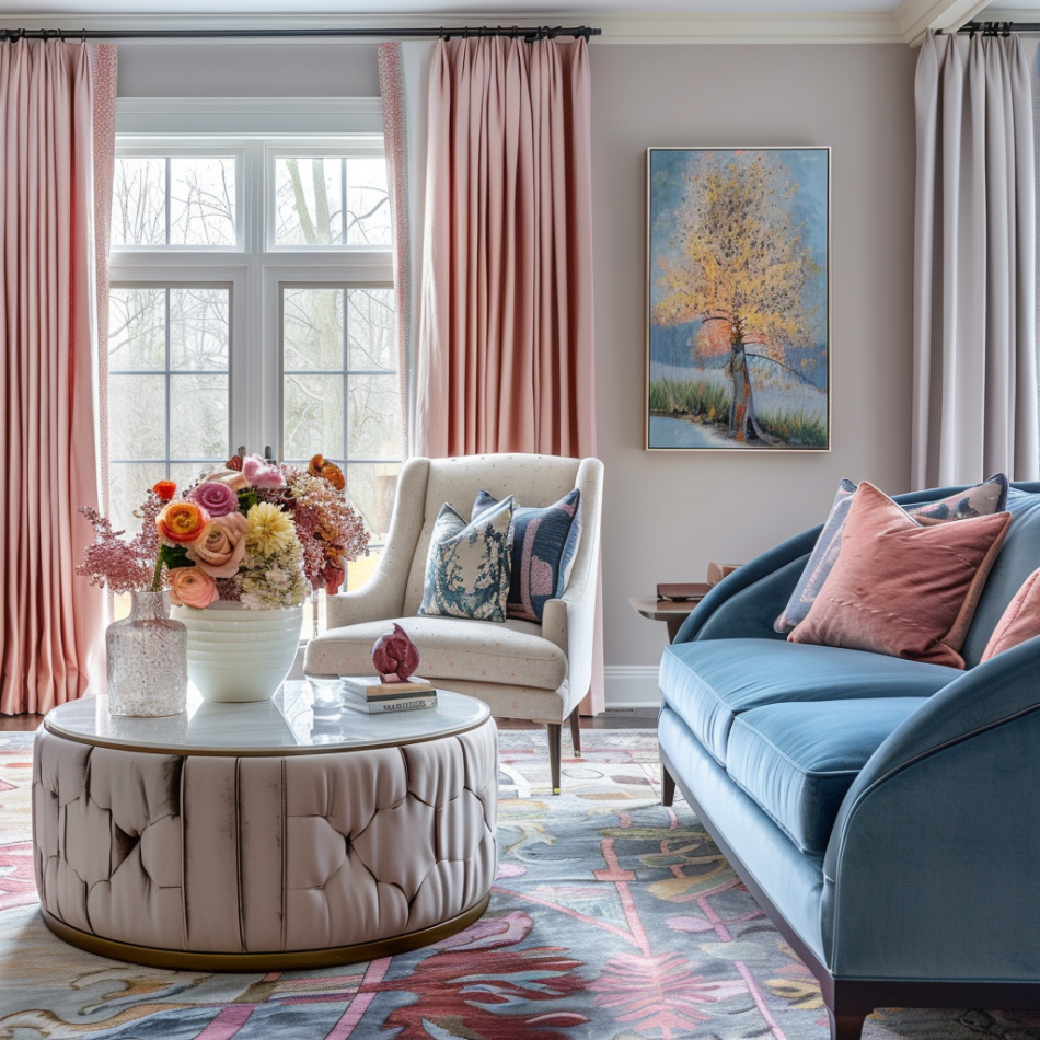
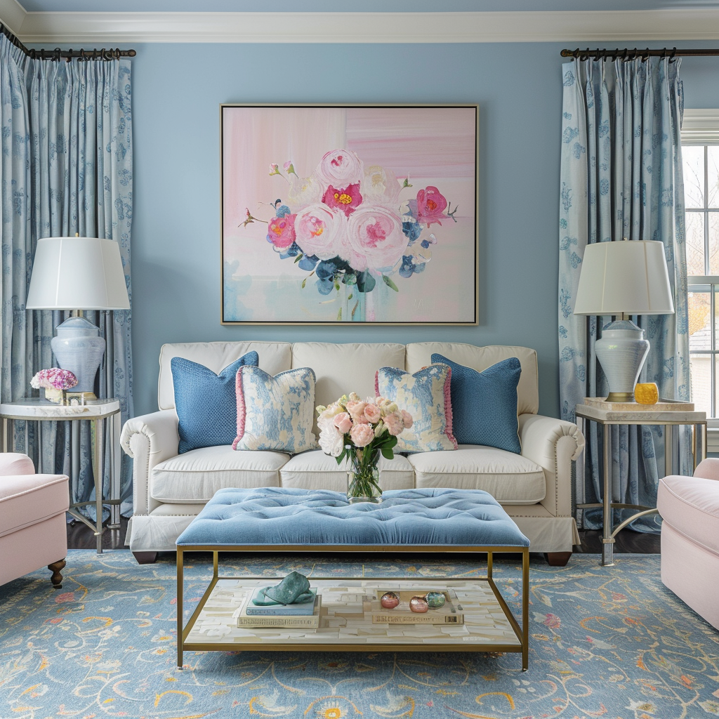
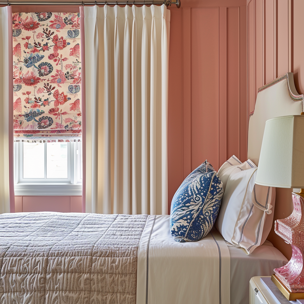
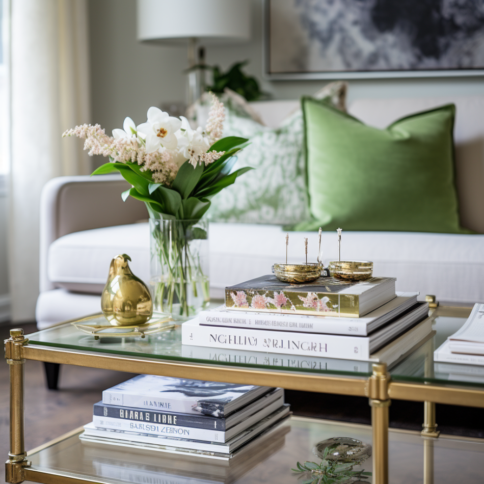
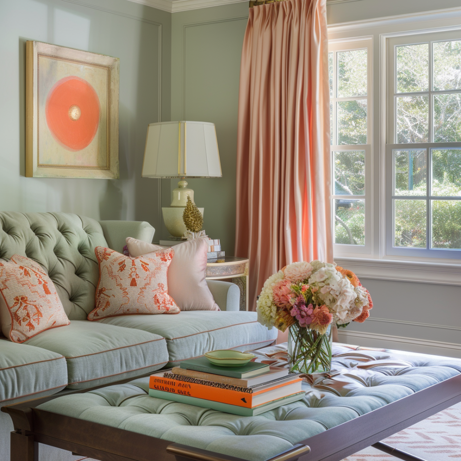
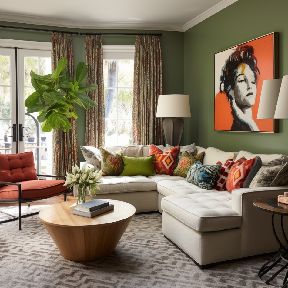
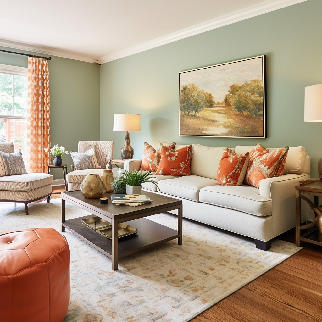
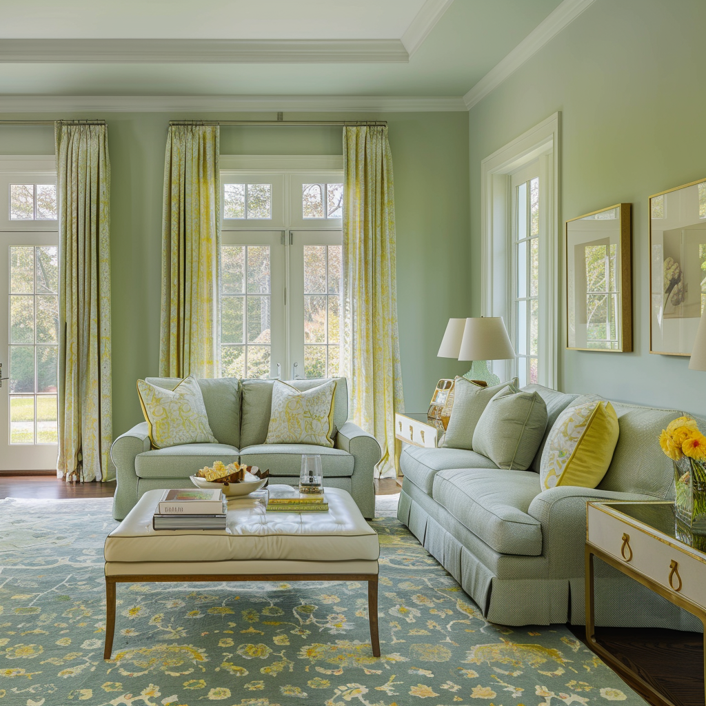
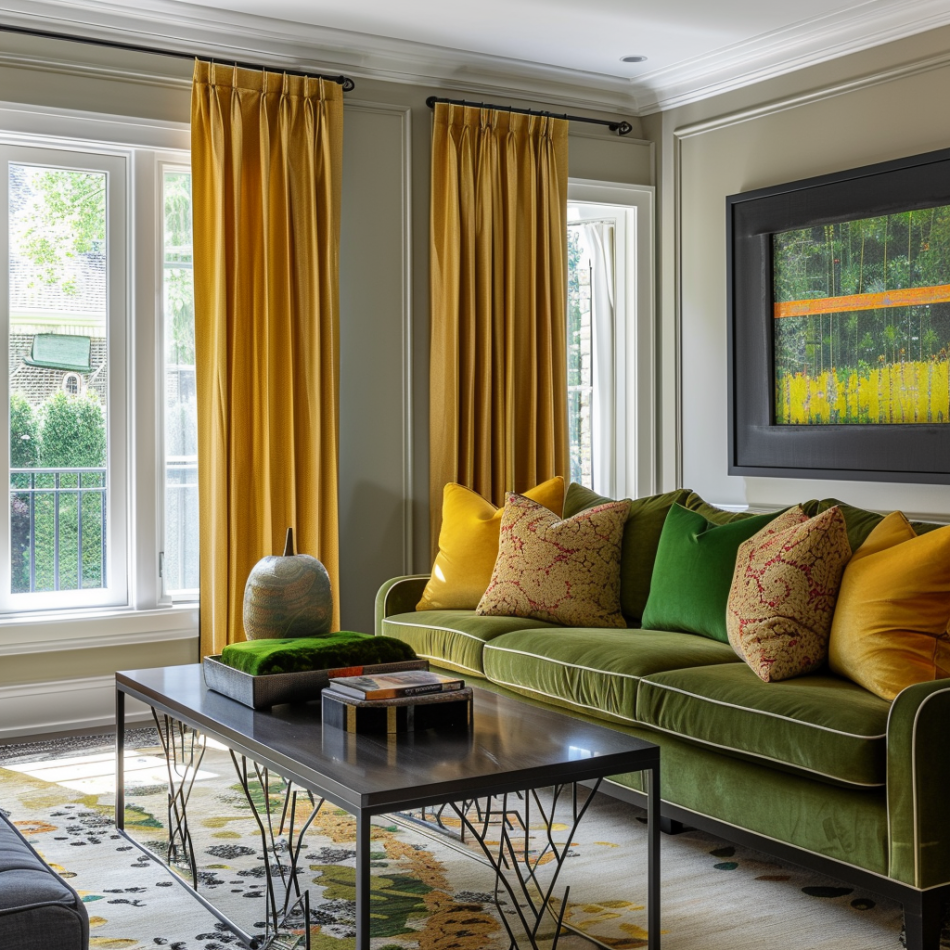
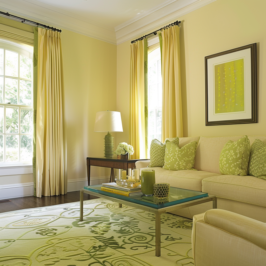
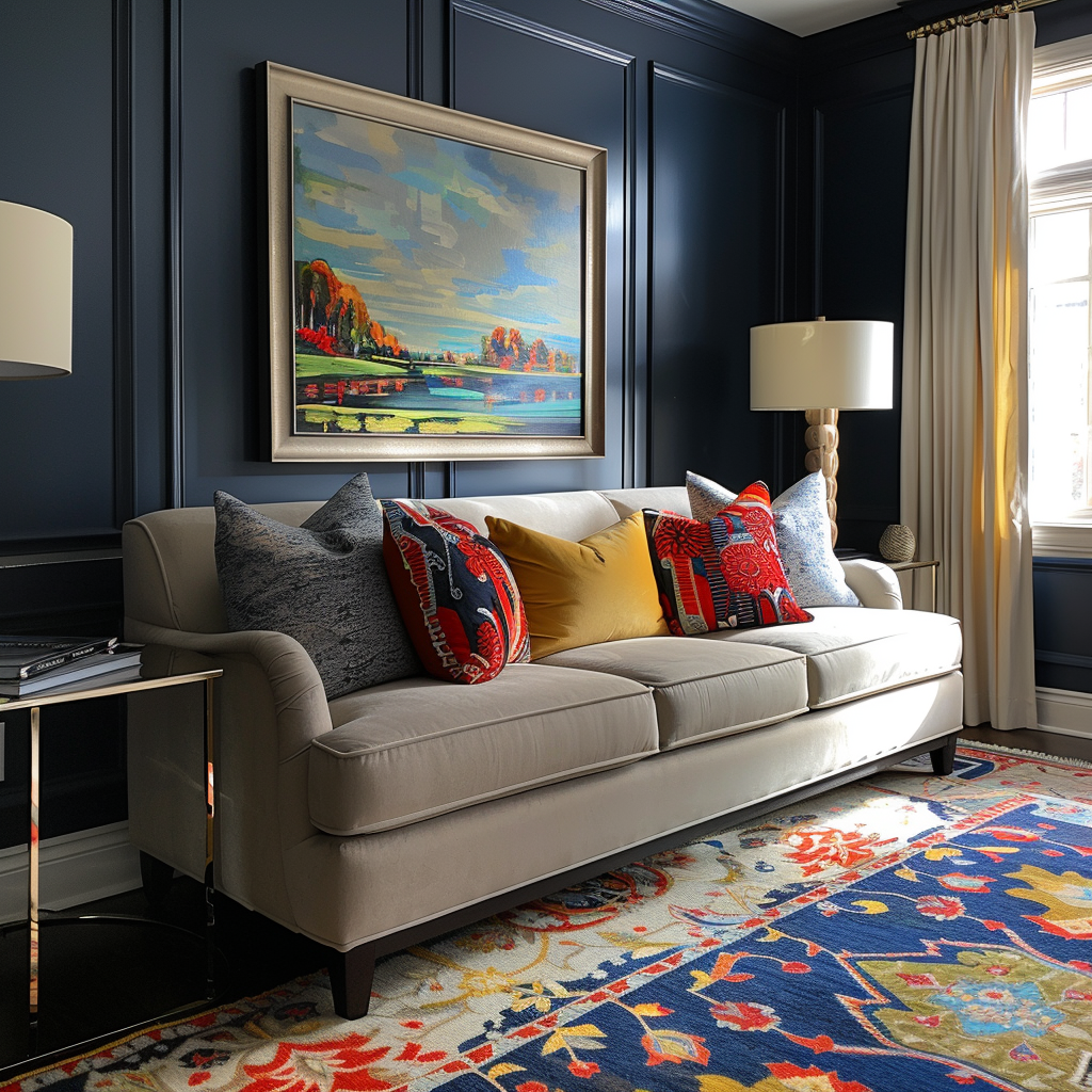
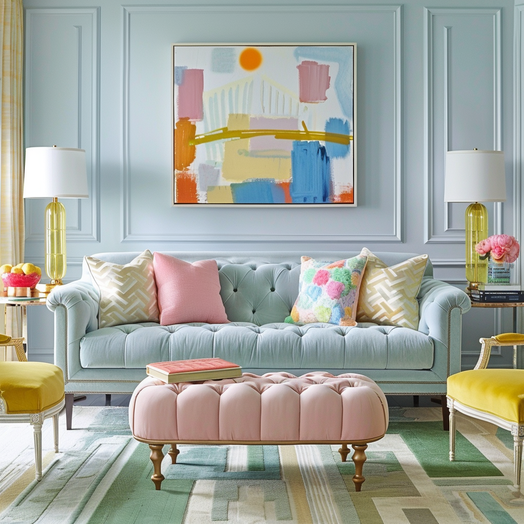
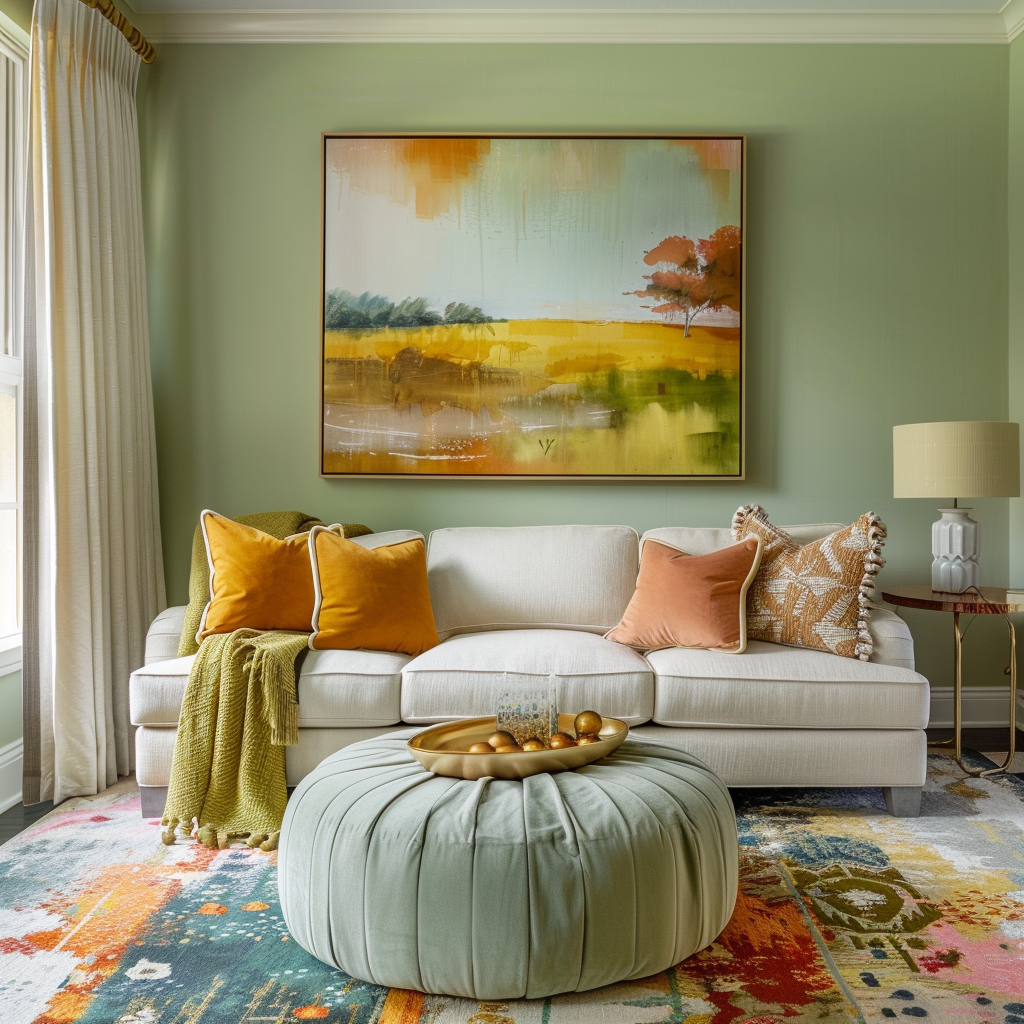
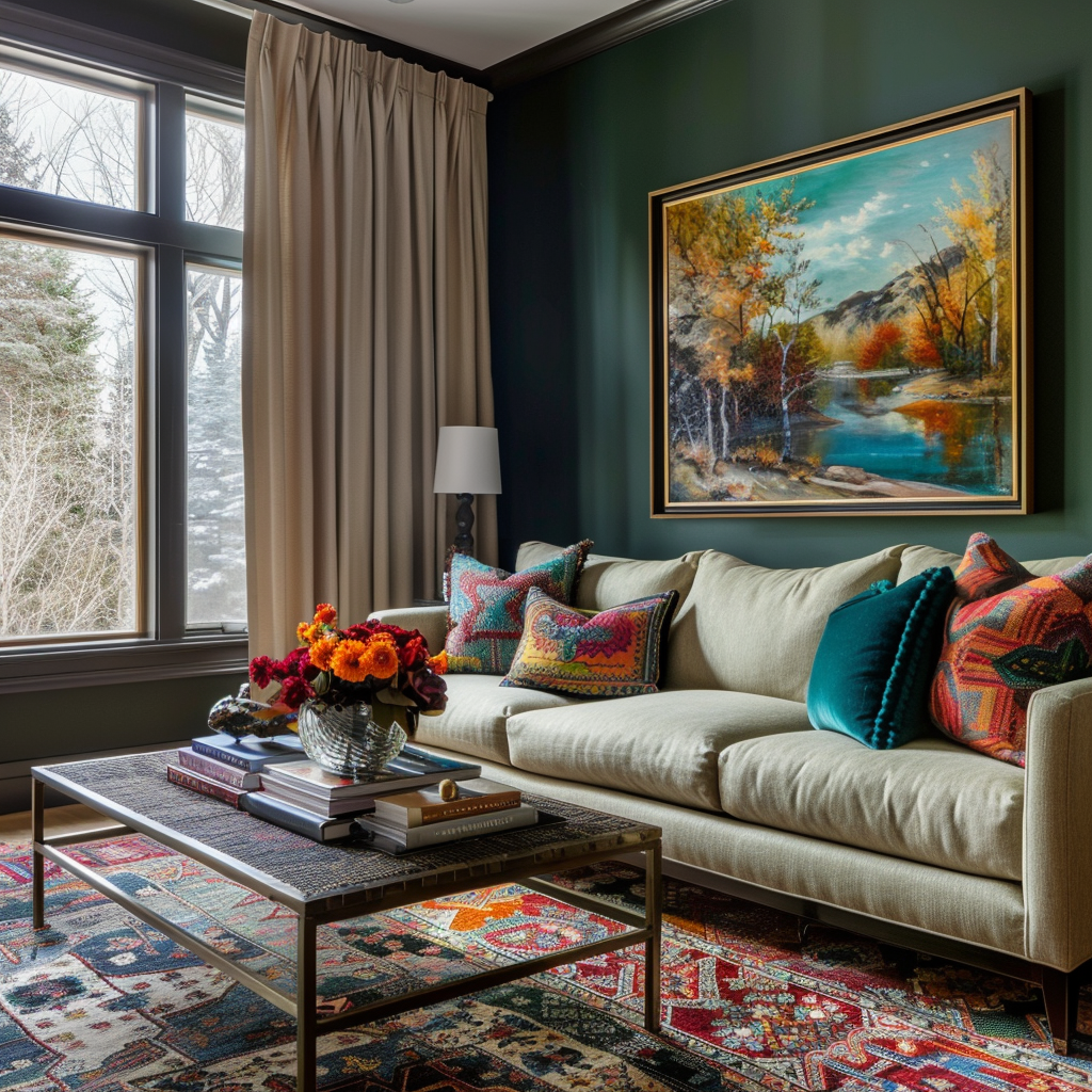
2. The easiest way to come up with a color palette is to use a piece of art, fabric or rug print as your inspiration and starting point. The reason being that color experts have already selected colors and undertones that work well together and in the right saturations. If you copy the colors for your space, you have your color palette. 

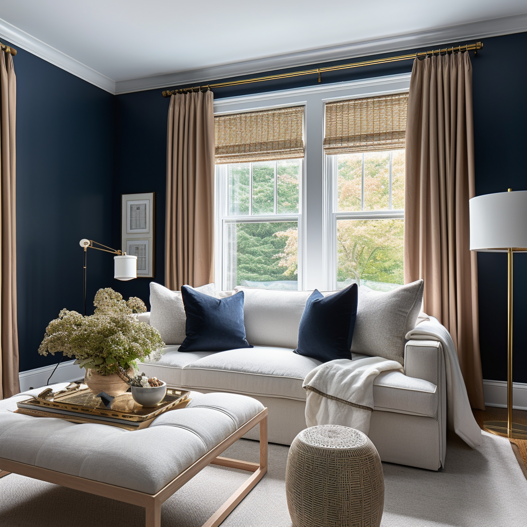
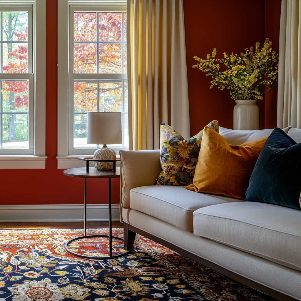
3. Now that you have your color palette, distribute colors around the room so it feels balanced. For example, if you have art with blue and yellow over the sofa and on your pillows, also use blue in other areas of the room. 

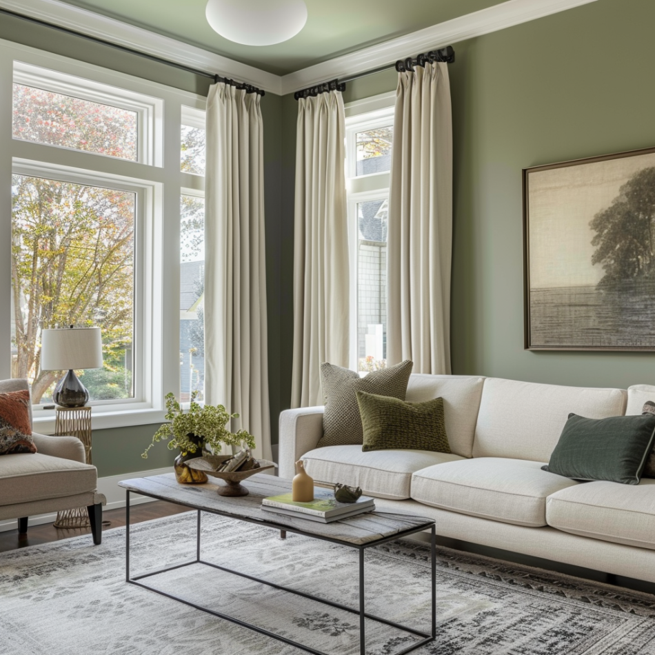
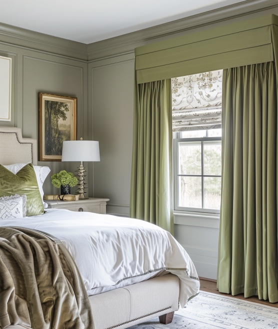
4. Use color at different heights in the room to also help with a balanced look. For example, if you have green on the rug, repeat it on the mantle or wall.

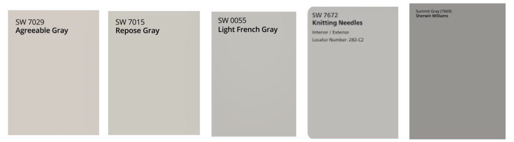
5. For paint, see the color in your room before you commit to painting the whole room. You can either buy a sample from the paint store or order them already painted from Samplize. If you choose to paint your own sample, paint it on white poster board (instead of directly on the wall) This way you can also move it around the room and look at it where you get more light and less, and against different furniture. Always place white between sample color and existing wall color when viewing, so that the sample doesn’t pick up the color or undertone from your current paint color. Look at it in the daytime and at night. 

FAVORITE WHITES 


FAVORITE BEIGES


FAVORITE GRAYS


FAVORITE COLOR PALETTES

Notice that color can be used either only in accessories or on walls and furniture. How much color you use and in which saturations, from pale to bright to muted to dark, depends on your likes and the mood you want for the space. 

NEUTRALS
BLUES 

Blue is the most popular color for decor. Depending on the saturation, it can feel calm, happy, serious, elegant, playful…


BLUE AND WHITE OR OFF WHITE

From soft blues to navy, this is a very timeless and beautiful color palette anywhere in your home. Use blue for accessories only or on the walls too. 


BLUE AND YELLOW, YELLOW AND BLUE

Bright yellows are better suited for accessories and more muted yellows are better for walls


BLUE AND GREEN, GREEN AND BLUE


BLUE AND ORANGE, ORANGE AND BLUE

Orange for walls can be overpowering. Pair with a lot of neutrals too. 


BLUE AND PINK, PINK AND BLUE

GREENS

Green is the most neutral of all the colors (that are not neutral). It is also the color that, for the most part, you can use in different shades and saturations in the same space and it works. This is because that’s the way green appears in nature and our eye finds the combination of greens to be pleasing. 


GREEN AND ORANGE

Green is the most neutral of all the colors that are not neutral. It is also the color that, for the most part, you can use in different shades and saturations in the same space and it works. This is because that’s the way it appears in nature and our eye finds the combination of greens to be pleasing. 

Orange in bright saturations may be overpowering for walls. Depending on your space and your style, you may want to use bright oranges in smaller amounts accessories, art, pillows or other textiles.  


GREEN AND YELLOW

Green is a nice color for walls too, as is a soft yellow. Brighter saturations work well for accessories or combined with neutrals. 

FAVORITE SHERWIN WILLIAMS COLORS:

Blues – 222-C1 Misty, SW2863 Powder Blue, 223-C3 Faded Flaxflower, 253-C6 Naval  

Yellows:  140 C-1 Ivore, 136 C-1 Lantern Light, SW2857 Peace Yellow

Greens: 156-C2 Bonsai Tint, 213 C-3 Clary Sage, 213 C-6 Oak Moss

Pinks: 114 C1 Romance, 102 C-2 Irresistible, 112 C-2 Lotus Flower

Oranges: 290 C-7 Copper Wire, 120 C-5 Determined Orange, 120 C-3 Inventive Orange

MULTI COLOR PALETTES

Can be bold or soft.  To make it simpler putting a multicolor palette together, find your inspiration piece first. This may be a fabric, art, or a rug. Remember to create balance using the colors around the room and at different heights. Also give the eye places to rest with neutrals.

Embrace color! Used in the right way it can create beautiful next level rooms you’ll love to live in.

Want help putting together your perfect color palette with all the right accessories?  

Schedule your in-person or virtual consultation today!

E@nextlevelinteriors.com