Color is the first thing most people notice when they walk in a room and it can make or break the design. Even neutrals require a color plan to get all the undertones right, so make color one of the first items in your overall design plan. Color can be complicated but I’ll give you some great tips to use when choosing color.
- Before you start, know your color style. Do you like all neutral spaces (or are just choosing neutrals because you don’t feel comfortable making color choices). Do you like a neutral background with pops of color, do you like colorful walls or furniture, or do you like color all over? Do you like pastels, bright, or dark colors? If you are not sure, look at pictures on Pinterest and start your own inspiration board of rooms you like based on color. You’ll start to see a color and style pattern in the rooms you are attracted to.
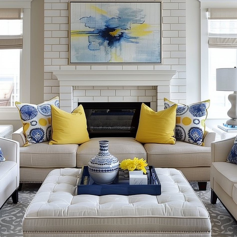
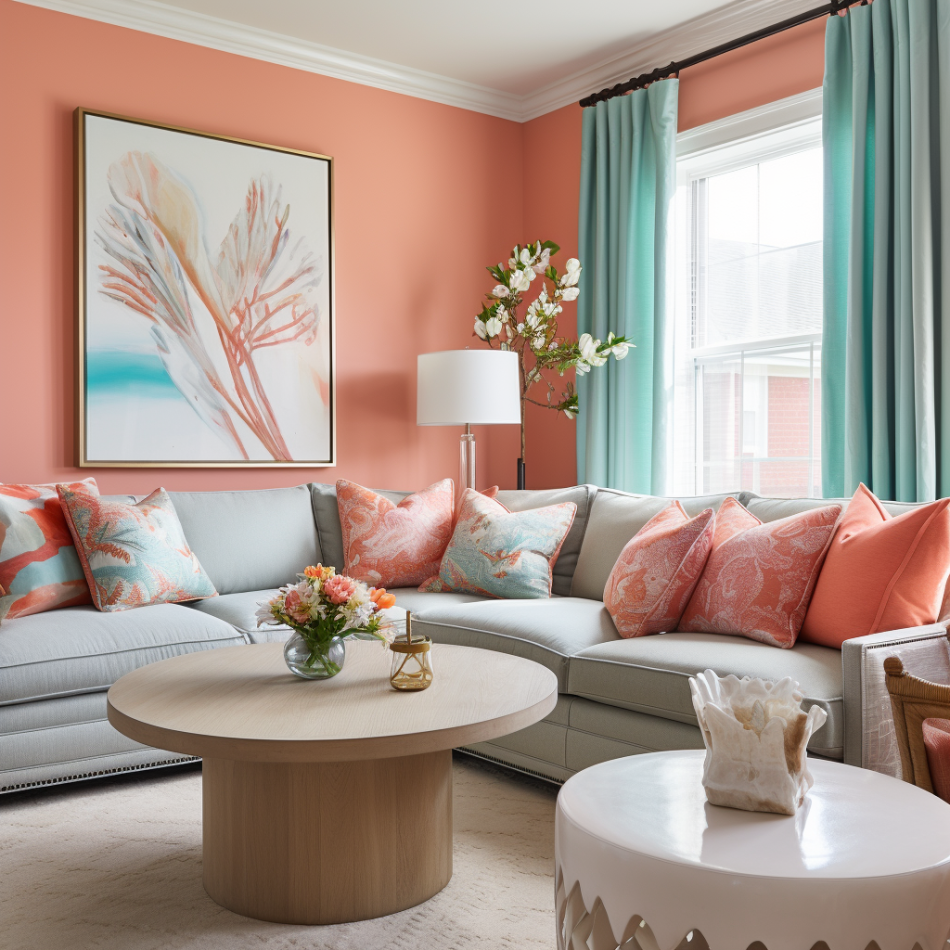
2. Choose an inspiration piece. This can be a rug, artwork, or a fabric print. The advantage of starting with an inspiration piece is that an expert has already chosen colors that work well together and the saturations to use. The inspiration for this mood board below was the rug. It already has a 3 color palette we can use – navy for the chairs and some accessories, teal and yellow for other accessories, all colors repeated on artwork above sofa. You can use the 60:30:10 rule and use color in those percentages and distribute around the room. 
3. Repeat color at different heights and around the room to create balance. Colors from the art below are repeated on the furniture and the pillows. The bright yellow is high on the window treatments and repeated again on pillows and florals. .

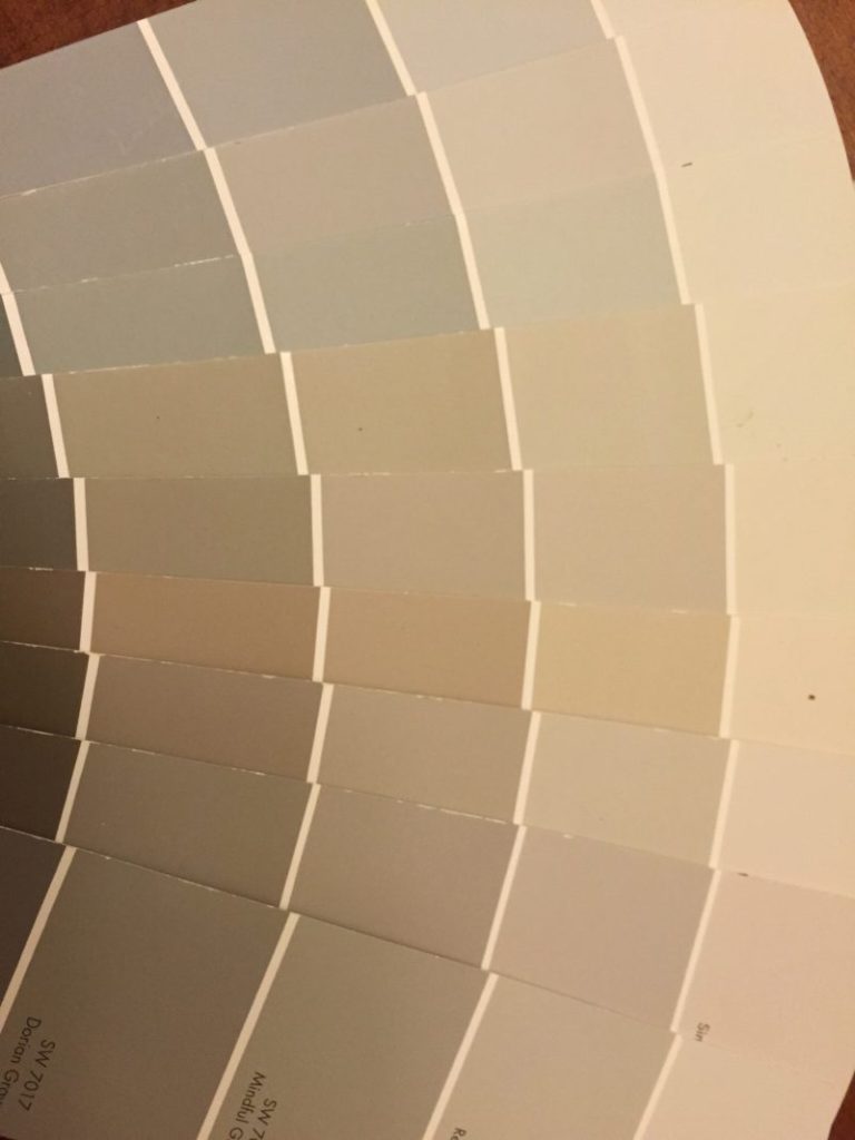
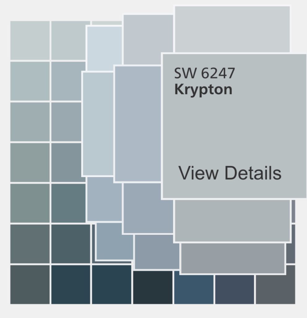
4. Pay close attention to undertones. Every color has an undertone, some work well together, some don’t. If you are not used to working with color, the best way to see the undertone is to compare similar colors. Ex: Put gray color samples next to each other and you’ll see some are bluer, some greener, etc. When a neutral room looks off, it’s likely because you have too many undertones or undertones that do not work well together. Ideally you shouldn’t have more than 2 neutral undertones in one space.
Gray has these undertones: Blue, green, red/violet
Beige has these undertones: yellow, green, pink. Yellow and green undertones work well together, yellow and pink undertones not so much.
5. Try out color samples before you commit to painting. You may either paint the color on a posterboard or buy it already painted through Samplize. Have a piece of white posterboard between the color sample and the current wall color. This way you won’t be picking up undertones from the current wall color when looking at the new colors.
The right use of color creates beautiful rooms.
Schedule your in-person (North Atlanta, GA) OR virtual consultation today and let’s create your next level home!
E@nextlevelinteriors.com 678-935-6398