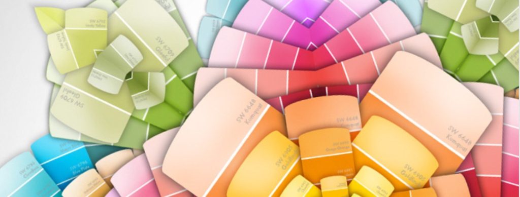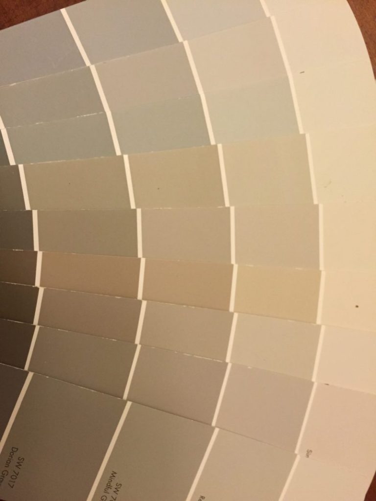
Often when we want a neutral paint or fabrics, we think we want just gray or just beige and it will go with all our other beiges or grays. Not so! A neutral decor palette is many times the most difficult to accomplish if you are not paying attention to the undertones. If you walk into a room and something in the color palette seems off, it’s usually because of conflicting undertones in the paint or fabrics.
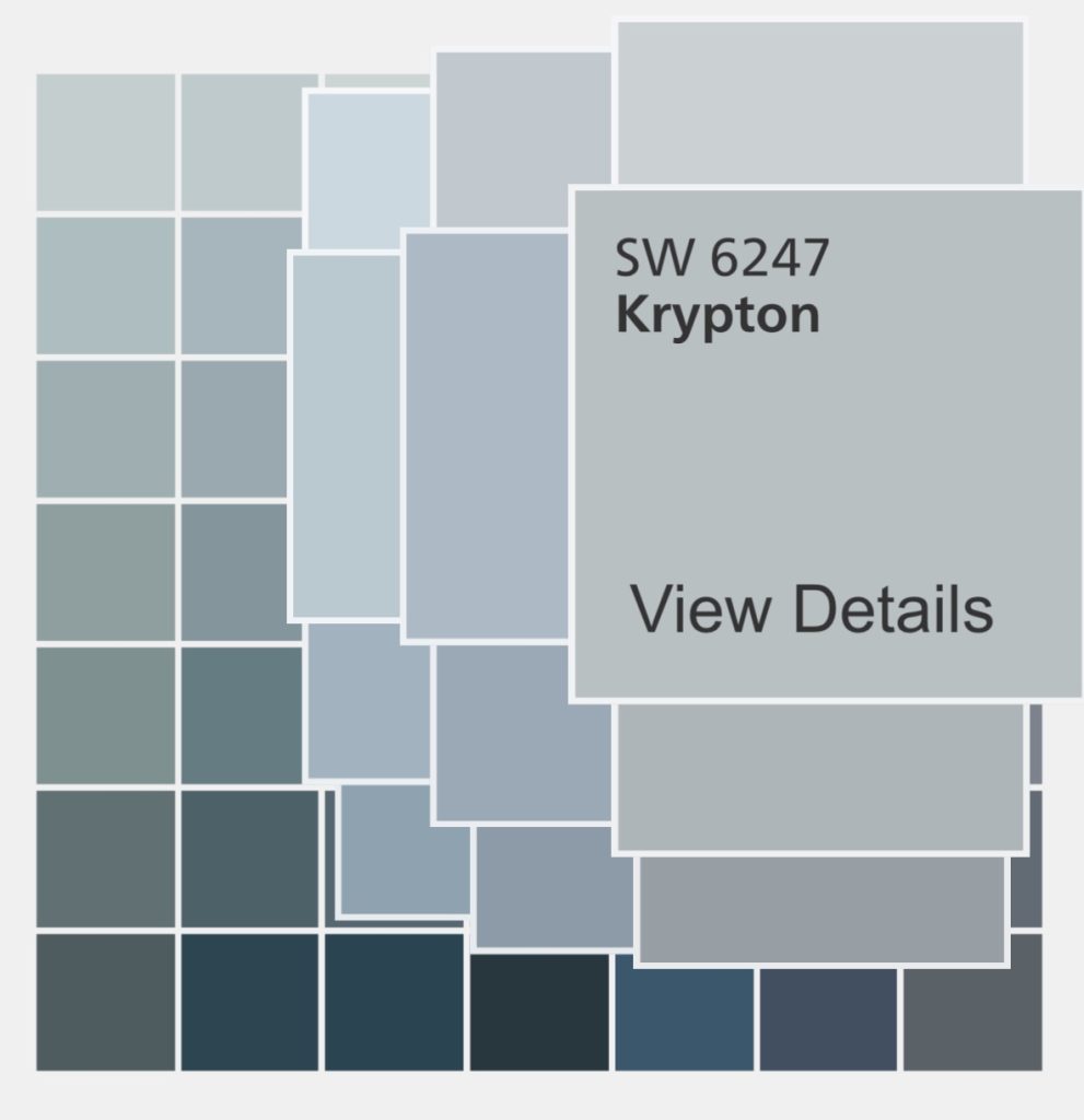
It is critical that you choose a paint that has an undertone that works with the other undertones in the room. For example, a beige sofa that has a pink undertone (and there are many!) will not look right against a beige wall that has a yellow undertone. Gray, which has been a go to neutral in the last few years, will have undertones of blue, green or purple. Gray paint with blue undertones will look a lot bluer on the wall than on a paint chip, so make sure you like blue. If your eye is not trained to see undertones, the best way is to compare colors side by side. Then you will start seeing that some look more green, more purple, etc.
If you are adding new upholstery, window treatments, rugs, or other softwood pieces, choose those before you choose your paint. Then choose paint to go with the new items. Don’t be afraid to call a decorator for a fabric and/or color consultation. It will save you a lot of money in the long run.
What you need to know about grays before painting